Wednesday, November 25, 2009

Up Yours - billboard

I saw this billboard today while on my travels between Johannesburg and Pretoria (Let me not bore you with that trip report) And as a keen billboard enthusiast... wait a minute, that sounds odd, who in their right mind would ever confess to being a billboard enthusiast? Ok, I do.

I digress. As a billboard spotter, who has a particular fondness for Out of Home advertising, I obviously try to look at every billboard that I pass. Dangerous business by the way, we have so many these days that you don't get enough time to concentrate on the road.

So there I saw some new artwork on one of the 3x6 urban signs owned by the nice folks at Media Power. It was a little confusing at first but you know how the image of a 'pretty' lady looking out at you almost always catches your eye. Especially if you're a guy.

So the main image shows this woman who looks like a secretary, pushing her glasses back up onto her nose using 'the bird' or 'the finger' or as we say it in Jo'burg, 'a zap sign'. My immediate reaction was: ' hey, wtf!' and , 'why is she imitating our President?' (I see Jacob Zuma has learnt to use the index finger now.. ;-)
I didn't immediately recognise the advertiser as the yellow lettering on the white background isn't the best option but after doing a quick double take I saw it was Teasers. Then I noticed the secondary image in the background, which was a photo of a previous out of home campaign by the same advertiser, Teasers. That campaign however was previously banned and there was a big black strip over it with the words ASA Banned. There was a whole debate about the ad making inferences to Caster Semenya.


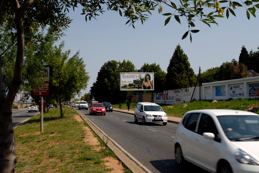
And then the penny dropped and I burst out laughing. I think the message is subtle enough though and I'm sure that someone will complain about this too, not about offensive nudity which will no doubt deprave and offend every male above the age of five. But how it's teaching our women, also over the age of five, very rude sign language!
I hope not, there are to many people who are leaving all their child rearing to billboards and they are the ones who tend to complain.


As this blog is really about creativity on billboards, I can't say that this one scores high in that department. The idea is good, the execution is ok but the whole thing doesn't gel together well. The yellow text is, as I said, not that legible. I think what you are supposed to read is: ' See our ASA banned Girls' but the execution doesn't quite get that right. In fact the word 'girls' also gets lost against the background. As far as keeping it simple; a little too much happening. There are two messages here, 'come see our girls' which is obviously the main idea and the second message to those who don't like their campaigns and who banned their campaigns.

But is the add, effective? Well, I must confess that it caught my attention and, if I was so inclined, I might take note of the fact that Teasers has 'Banned' Girls and perhaps go for coffee. :-P The mere sub-category of advertising will always cause a stir so people will talk about it and that in it self is effective, right?

the original offending billboard, here is what it looked like!

Tuesday, June 9, 2009

Just a pretty face..

This billboard is on the corner of William Nicol and Sandton drive. I was alerted to this beauty by a fellow Designer Twitterer last week. Thank you @anjavanstaden. It seems that who ever did this job decided to just: 'find a nice effect on the web - do the tutorial-and slap it on the billboard' - let the client pay.
This billboard is in one of the prime positions in the Sandton/ Johannesburg area. I shudder to think what the monthly media rate is here. (more than my yearly income perhaps?!) My personal feeling of this board is that it is pretty yes, and maybe the brief was: " Ok design/creative team, we're gonna throw some money at making a pretty billboard so that the people who see it will like us for bringing them something nice to look at and so will have good will toward us and will therefore support our product..." yeah right! Come on guys if we're branding a product, cool, that gives us a lot of opportunity to make it special to make it fun, interesting, dramatic and yes even magical but this is just a purdie pictcha on a big board. It has no viral effect, other than the three of us who write and read this blog.. ;-)
Of all the marketing media, I feel that the billboard or Out-of-home medium is one of the old school mediums that will be here to stay. at least until we've discover tele-porting, because we'll all need to travel from A to B in some way. Hmm.. maybe if we get personal flying machines we'll even have floating billboards on the roads in the air... who knows? Other Media types will come and go and gain / loose some piece of the advertising spend pie.
Now just because I have DSTV / MNet here it doesn't mean that all the other billboards arround Jo'burg are just hunky dorey on the contrary, 95% are much worse than this one... But I don't want to give every blerrie billboard an audience (of three) no no no, I want the good stuff. So if you find something really good, let me know!

Tuesday, June 2, 2009

Bet your bottom dollar on this billboard!


Last week I was driving through town when I came upon this billboard.

At first it was not very clear what it was saying, but boy I soon realised it was a beauty. A billboard covered in 'Money' , infact it was so well done that at first, I thought, they had used real money and stuck it to the substrate, closer inspection however revealed that the money was in fact printed on the board but the production co had also randomly stuck on some 'bills' which were flapping in the wind. Genius, it was so realistic I had to walk up to the board to find out how they had done it. The advertiser is thezimbabwean.co.uk which is the web page for the similarly named news paper. Now, I don't know much about the actual newspaper and weather or not they have a printed version, but I now know about the web page.
For those who are not familiar with the shenanigans of our friends across our northern border, they have had to contend with an inflation rate higher than the number of hours in the month! I mean we are talking 100.000.000 % in 5 years or something equally ridiculous. And yes their local currency is now worth less than wallpaper and probably less than toilet paper too (there's a great billboard idea in there as well ;-)


This, in my mind, is good creative, it's the sort of thing I would look at and it will give me a smile and it's something I will talk about around the proverbial water cooler. Since I don't have a water cooler and I work alone, my next best option is to blog about it.
We can go into the effectiveness of this type of creative. I believe that the target market, at whom this billboard would have been aimed, would very definitely have seen it and made an instant connection with it. Of 'course without the proper market research we can't know for sure. But after over a decade of working for an out of home media owner, my money is on this board... and the Zim dollar, quite literally.

Thursday, May 7, 2009

Feeling Blue

This trailer billboard was also snapped a few days on William Nicol. This is the type of thing that gives me the heebie-geebies (and that's a bad thing)
At the best of times these trailer ads are placed on prime spots and I guess they don't pay rentals to any land lord
as all the other out door media owners do. But you can't fault the moving billboard company for doing this, as they are likely able to give a good price to the advertisers, again I stand corrected.
But even though the advertiser got a good price to have his poster displayed, at least he could have spent some time on getting the design right for outdoor advertising. Let's count the problems:
The use of colour. Blue on blue, I wonder who thought that would be a bright idea? What is the first thing that you need to get right in outdoor creative? Contrast. Thank you.
I suppose the What's upp caption in the graphic is supposed to be funny/a pun, but if you don't know that it is the acronym of the business name, then you'd think it was a spelling error. Not that you would see it anyway, as the colours don't make this board very readable!
Next trick, oh my favourite, let's duplicate our newspaper / print add cos that has brought us a lot of leads.... nonsense.
As you can see, there are enough problems in this billboard to last a life time. I put it her because it helps to educate. You can't blame the client if they were not properly educated on the use of outdoor advertising.
Look and learn!